
Sedona drew a line in the desert.
When McDonald’s tried to bring its blinding golden arches into this red-rock sanctuary, city officials pushed back hard. A global giant collided with a tiny town that refused to bend. What emerged wasn’t just a strange turquoise logo, but a quiet rebellion against visual nois…
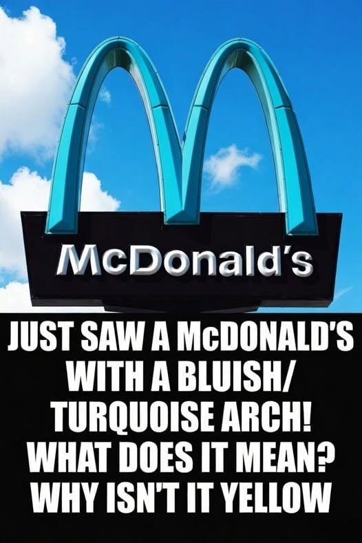
In Sedona, Arizona, the landscape isn’t just scenery; it’s the heart of the community. When McDonald’s arrived in 1993, the city’s strict design codes weren’t negotiable. Officials feared that the iconic yellow “M” would scream against the muted reds and browns of the desert, hijacking attention from the cliffs and canyons that define the town’s identity.
Instead of backing down or walking away, both sides chose an unexpected path: compromise. The arches would remain, but their color would change. Turquoise, a hue tied to the Southwest and gentle against the rocks, became the new symbol. That single design decision transformed a routine fast-food outlet into a quiet landmark. Tourists now photograph the arches as eagerly as the scenery, and Sedona’s story is told in every snapshot: a small city proving that even the biggest brands can adapt, if a place protects what it loves.